
In Black and White: Family Immigration and Deportation Illustrations

For the Fall 2017 issue of VERDICT –a journal by the National Coalition of Concerned Legal Professionals – I created these quick, visceral black and white illustrations on what desperate families crossing our borders face. I drew these images in August 2017, they sadly have even more resonance today. What do people in this situation feel? What does a child feel being separated from parents? How would I feel? These are the questions I ask when I created these drawings to help me capture an emotional truth in each piece.
Child Internment Illustration by Chuck Todd, Verdict 2017. Pen and Ink/mixed media on board

DETAINED Illustration by Chuck Todd, Verdict 2017. Pen and Ink/mixed media on board
Pen & Ink, mixed media Illustration by Chuck Todd for Verdict story on Immigration and Deportation
The image below shows a young girl being taken from her parents by U.S. officials. I created this drawing for the January 2015 issue of VERDICT, about laws that allow children of foreign nationals to be taken from their parents. The drawing now seems like a foreshadowing of what is happening in 2018 on a massive scale.
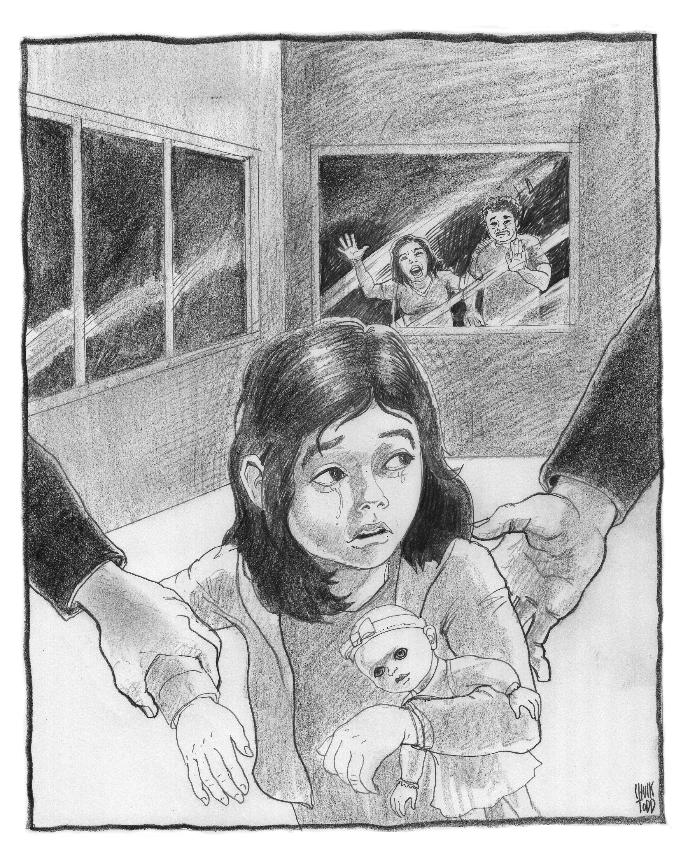
Deportation Officials take a little girl away from her parents who are seen crying in the background. Pencil drawing by Chuck Todd. Published by Verdict in Jan. 2015
Eastern Fox Squirrel illustration for Los Angeles Magazine
For the September issue of Los Angeles Magazine my illustration of a fox squirrel accompanies a Know Your Neighbor column by Jason G. Goldman. I have turned in artwork for October’s column and am looking forward to more wildlife illustrations for the monthly column. As they publish I’ll share.
Here is the link to the column with some fun facts on how non-native fox squirrels found their way to Los Angeles and Southern California.
http://www.lamag.com/citythinkblog/know-your-neighbors-eastern-fox-squirrel/

Eastern Fox Squirrel illustration in Los Angeles Magazine http://www.lamag.com
Injustice: When justice attacked and rendered powerless
It seems that too often in America justice fails us.
Yesterday’s grand jury announcement that there would be no criminal charges against the police officer who killed an unarmed 18-year-old named Michael Brown in Ferguson, Missouri sparked more rage, unrest, looting, riots and violence. Many more people were hurt and buildings destroyed in Ferguson. Unrest, protests and riots happened around the country last night and including close to home in Oakland.
Today, It seems fitting to post a b&w illustration I did last year for VERDICT on the theme of justice being cut down and rendered powerless.
We should not let injustice, racism and violence rule in any form. We have work to do as a nation and in our communities to mend justice and find true peace and equality.

Chuck Todd Illustration of Lady Justice being attacked and cutdown, rendered powerless. Created for VERDICT
Chuck Todd’s Smartphone Kill Switch artwork featured in newspapers; Huffington Post story

Artwork by Chuck Todd for Bay Area News Group; Illustration was also used by Huffington Post. “Kill Switch” technology locks down smartphones in an effort to keep phones and private information out of the hands of thieves.
I created this illustration for Bay Area News Group to go with a Dana Hull story on lock down technology used by Apple and other smartphone makers to thwart thieves from stealing private information from a cell phone. In print the illustration ran in the San Jose Mercury News and in the Contra Costa Times in the TechMonday business section. I few months later I was delighted to learn that my artwork was also picked up by The Huffington Post and ran with this story: http://www.huffingtonpost.com/2014/04/16/smartphone-kill-switch_n_5158926.html
The illustration was created with pencil, photocopy and Photoshop. I wanted to really push the threatening feeling of the hands trying to snatch the iPhone. I did this as a separate drawing, xeroxed it to push the blacks and texture and then worked back into it some more. On another piece of bristol board I drew the hand and the lock with chains wrapping around the iPhone to keep it locked down. I scanned both in and accented the hand and phone with color in photoshop. Keeping the background black and white was more striking and sinister. This approach harkens back to my love for printmaking and etching.
Freud and Siri

Freud attempts to get inside the mind of Apple’s enigmatic Siri.
Recently I got this illustration assignment for a Pat May story published in the San Jose Mercury and Bay Area News Group papers. Pat was interested in finding out what made Apple’s enigmatic, helpful (sometimes) and mysterious female concierge tick. He wanted to get inside SIRI’s head. To do that he enlisted the help of a local psychologist to probe and ask SIRI questions to discover the mind behind the iPhone voice.
Trying to psychoanalyze SIRI was a fun assignment to get. When the story was pitched to me by the Business editors we hit the idea of putting SIRI on the psychiatrist’s couch. I took the idea and ran with it. And what more famous couch…or psychiatrist to dive into the mind of SIRI than Sigmund Freud himself. No kidding on running with this assignment….with other newspaper deadline work I had just a morning and part of the afternoon to go from thumbnail to finish.
You’ll find in the illustration a few apple and female related symbols.
You’ll find Pat May’s story at this link:
A goodbye to James Gandolfini and Tony Soprano

Detail of James Gandolfini as Tony Soprano. Illustration by Chuck Todd
The funeral for actor James Gandolfini was held today in New York City. Gandolfini died last week of a heart attack in Italy at the age of 51. Gandolfini brought the character of mobster Tony Soprano to life in HBO’s “The Sopranos.” He breathed into the character complexity, vulnerability and a violent power seething under the surface. So sad to lose such a great actor in the prime of his life.
As friends and family of the actor gathered to celebrate Gandolfini’s life I thought I would share this illustration I did of Tony Soprano for the Contra Costa Times when “The Soprano’s” ruled.

Pencil and watercolor illustration of Tony Soprano (James Gandolini) in boxing gear for The Contra Costa Times

Battle for the Emmy’s A&E cover for the Contra Costa Times. Illustrations by Chuck Todd. background and design by Dave Johnson. Art direction by MaryAnne Talbott.
The A&E cover for the Contra Costa Times featured boxing poster take on “THE BATTLE FOR THE EMMYS” with James Gandolfini and Martin Sheen portrayed as boxers as “The Sopranos” and “The West Wing” fought for Emmy Awards supremacy. I created the characters of Tony Soprano and President Bartlet in pencil and watercolor adding in boxing gloves, shorts and some details that matched each character. Fellow artist Dave Johnson did the design, background photographer and combine them in photoshop…art direction by MaryAnne Talbott.
RIP James Gandolfini.
VISUAL TRIBUTE TO GARY BOGUE
After 42 years Gary Bogue’s final column published in Friday’s Contra Costa Times.

Gary wrote his pets and wildlife column for the Times for 42 years. Amazing. More amazing is his wealth of knowledge, his empathy for wild critters and his connection to his readers. I have had the honor of working with Gary at the paper on graphics, wildlife posters….and on our three books for HeyDay Books. Gary is a great resource, a gracious and incredible collaborator and a dear friend. We have been on many adventures together to the Lindsay Wildlife Museum for research and events…and giving talks to schools and civic groups throughout the Bay Area. Gary is a pure storyteller, in his columns, in his books….and on our roadtrips to various events.
I’ll miss working with Gary at the Times…I don’t think the place will ever be the same. But, I better clear off my schedule. Now that he has more time…he’ll be hitting me up with many more book projects to illustrate. Bring it on Gary, let the adventures continue! And congratulations on 42 wonderful years of columns that connected, enlightened and raised millions in funds to help preserve open space and care for animals in the Bay Area.
Here is a link to a story on his amazing career in today’s CCT Times.


GUYPOCALYPSE NOW

Illustration by Chuck Todd for story by Bruce Newman for Bay Area News Group
Don’t blame the end of the male species on sex, drugs and rock and roll. A new e-book claims that violent video games and online porn are leading to the “Demise of Guys.”
In today’s online and print editions of San Jose Mercury News, Contra Costa Times and Oakland Tribune Bruce Newman writes about the new book.
Newman writes: ” Lamentations over the fall of man reached a crescendo recently with the publication of a celebrated Stanford University psychologist’s e-book, which suggests that guys may be doomed by their addiction to Xbox video games and X-rated video dames. Among author Philip Zimbardo’s more startling conclusions in “The Demise of Guys,” co-authored by Nikita Duncan: “Video games and online pornography could kill you.”
To read the whole story click here:
For the illustration I wanted to highlight the violent video games and online porn that the authors claim are isolating and rewiring the brains of men. I contrasted the physical play of a video game with the internal impact and social isolation. I drew the teen head and shoulders in pencil and created a separate drawing of the hands and the controller. Most of the line art to represent video games and porn was done in Photoshop. The zombies I sketched and scanned in. The rest was painted in Photoshop.
CLOUD CONFUSION

Here is my latest illustration for today’s (June 8) editions of the San Jose Mercury News and Bay Area News Group papers for a column by Mike Cassidy. With all of the “cloud” storage out there for apps, photos, documents, videos and such it makes it virtually impossible to keep track of the virtual clutter. Cassidy says that the “beauty of the cloud” doesn’t help when ” I don’t even know what cloud I’ve seeded with what document.” Here is a link to Cassidy’s column on http://www.mercurynews.com:
I explored the motif of having someone’s head in a cloud. Rather than it being a positive…the clutter of files swirl about…the cloud, like fog, makes it hard to see…or remember where things are. The cloud hides, twists and confuses around the head. I like the fog-like fingers of the cloud that start to wrap around the man’s head and in front of his vision. The final is painted in Photoshop on top of rough sketch. For speed, I sketched out the line art clutter in pencil on paper, scanned it in and layered it into the photoshop file.
THE INFLUENCE OF BARRON STOREY

I wanted to share an illustration project I did a few years ago for the Contra Costa Times that shows the influence on my work of master illustrator Barron Storey. Barron has done everything as an illustrator, book covers, Time magazine covers, National Geographic…he has a mural in the American Museum of Natural History and portraits hanging in the National Portrait Gallery.
If I have ever seen true genius at work it is looking at a Barron Storey original…once in illustrator Bill Koeb’s old apartment in San Francisco and I have had the luck of catching a couple of gallery shows in the city over the years. His sketchbooks are legend: His personal visual journals and his graphic novel work have influenced and inspired many artists: Dave McKean, Bill Sienkiewicz, Greg Spalenka, Bill Koeb, George Pratt and Kent Williams among them.
As a teacher he may be without a peer…so I hear. Barron is the reason I moved to the Bay Area in 1996 to pursue a graduate degree in illustration at the Academy or Art in San Francisco. I researched the influences of artists that influenced me…many of them cited Barron as an important influence. That’s how I discovered the Academy of Art and how I ended up in the Bay Area. My timing was a bit late. By the time I started my graduate courses in the fall of 1996, Barron was no longer teaching at the school, but was teaching at California College of Arts and Crafts and at San Jose State. Although I didn’t take one of Barron’s classes I was taught by artists who studied with Barron (Carol Nunnelly and my graduate advisor Bill Koeb)…so I was able to absorb some of his wisdom though them.
I have had the privilege of meeting Barron a few times. The first was at a gathering at Bill Koeb’s pad in San Francisco probably in 2000. About 5 years ago I was attending the Alternative Press Expo (APE) in San Francisco with Gary Amaro ( another of my graduate advisors. ) I had some samples with me including these Cancer Journey pieces.

About the Cancer Journey project. Contra Costa Times writer Dan Borenstein penned a five part series in 2007 on his harrowing experience with cancer and cancer treatments. I was honored and humbled by the challenge of illustrating each installment of the series. ( And indebted to Dan for sharing his story and giving me such a poignant project to be a part of.) I came up with the thought of a sequence of panels, interconnected that could each tell each part of the story individually. But when combined –on the final day of the series – made a sequence of panels telling the more complete narrative. The layering of elements, with drawings and line work is a direct influence of Barron. Not as much in the technique (who the hell can draw as well as Barron Storey?)…but in an approach to storytelling that I have soaked in from Barron’s journals.
Coming full circle: At the Alternative Press Expo, Gary and I found a table that Barron had been at to sign his journal book “LIFE AFTER BLACK.” I bought the book, word was that Barron was around and would be back. As we walked around the hall looking at the variety of local artists and creators we bumped into Barron. We talked for a bit and I asked if he wouldn’t mind taking a quick look at some of my work. He very graciously did…and when he saw the Cancer Journey images has asked me about them. I gave him a quick rundown of what it was about and said that I created them for the newspaper. He said something to the effect “Amazing work. So great that they published this in a newspaper.” I honestly died and went to heaven. I felt like I had come from the world of wanting to be…to being. That I had ascended the mountain top after toiling and struggling for years on the climb. From a dream of wanting to be better than I was as a visual journalist and illustrator in Missouri. From a dream of studying with the master in California and falling short. To finally, the master himself holding my work and finding value in it.
")
Barron continues to inspire me and give me something to aspire to. If you are not familiar with Barron’s work you should be. Here is a link
Here is the note Barron scribed for me in his book “Life After Black.” Thanks Barron.

CONNECTION POINT

In Today’s TECHNOLOGY section in the San Jose Mercury News and Contra Costa Times is my illustration for a Peter Delevett story on new startup services that allow users to stay connected to friends from multiple lists and networks from one central location. Many of the services use geo-location features that allows users to track friends, and their locations, in real time. Here is a link to the story:
This was a super quick turnaround. Thursday I had a thumbnail sketch approved, but I wasn’t able to start illustrating on the finished piece until Friday morning. The concept I came up with conveys a connection to many contacts in multiple networks. Of course this meant on Friday morning I cranked out 28 different faces in my sketchbook. ( I felt like I was doing a homework assignment for the late, great Barbara Bradley at the Academy of Art in San Francisco!) About two thirds of the faces are from photo reference, about a third are invented. ( I snuck in a few friends, family and even jazz musician Joshua Redman.) The main figure holds up her cell phone into the singular connection point that all of the other networks of friends are joined to. The circles were created in illustrator, the faces and figure were sketches I scanned in and rest was painted and combined in Photoshop. Starting on the faces at 9 a.m. I turned in the finished illustration to the designer at 5:30 p.m. I can’t think of a better way to spend a day!
Here is how to looked on the page, design by the talented Daymond Gascon:

IS INVESTMENT IN SOCIAL MEDIA KILLING REAL INNOVATION IN SILICON VALLEY?

With the recent Facebook IPO and a lot of venture capital spending going for the quick return of social media companies, there is a growing concern that the pursuit of the quick buck is killing real innovative technologies (in medical, robotics, clean energy, etc.) that take longer for a return on investment. This is my illustration for a Chris O’Brien column in the Sunday (May 27) San Jose Mercury News and Bay Area News Group papers and websites. O’Brien quotes entepreneur Steve Blank as saying that it is “pushing real innovation outside of our country. And it might be the demise of what we do in Silicon Valley.” O’Brien explores the ideas on solutions to the problem that Blank and others have, including the National Science Foundation Innovation Corps. program. You should pick up the paper or go to the story online to read the article…link is below:
For this illustration I used a landscape to depict innovation and contrast that with an opposite. The futuristic landscape is an abstraction of Silicon Valley. Innovation is like a bright light…so the sun represents the light of innovation and ideas. Massive clouds gather, casting a shadow over the valley and buildings and starts to block out the light source of innovation. In the cloud I had fun layering in swirls of money, a few social media companies…and even an eye from the back of a dollar bill. The cloud is building energy and momentum as it pulls in more money.
Here is how the page turned out with a great design by Daymond Gascon.

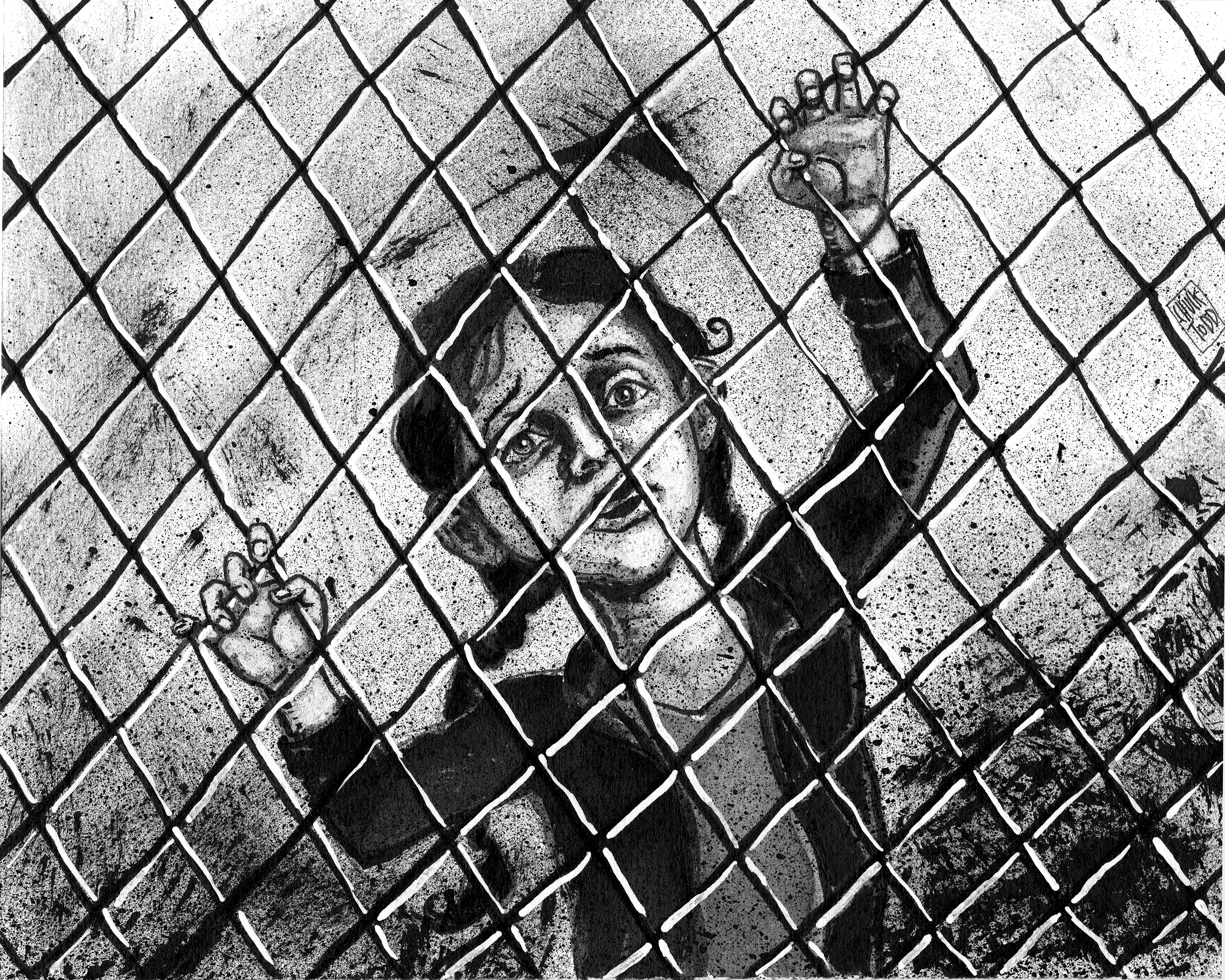
THE VERDICT: IMPRISONMENT WITHOUT DUE PROCESS

Illustration for The Verdict by Chuck Todd
A couple of quick, direct black and white images for The Verdict – a quarterly journal published by the Coalition of Concerned Legal Professionals (CCLP). I created these a couple of months back, the magazine should be out soon.
The illustration is for an article on the National Defense Authorization Act and its lack of constitutionality and due process that allows for indefinite detention of individuals. Senator Dianne Feinstein has submitted to Congress the Due Process Guarantee Act that would prohibit the indefinite detention of American citizens or permanent residents.
The edgy, gritty images show individuals who have lost their freedom, they are prisoners who have no voice or rights. The illustrations I do for Verdict are always black and white…bring out my printmaking, pen and ink and sequential art skills and influences.

Prisoner spot illustration for The Verdict by Chuck Todd
Sinister Malvertisements: Even when you don’t click sneaky cybercrooks use these ads to attack

This is a very disturbing trend. Disturbing and scary make for some great visuals. So…OK, I admit it. I had a lot of fun with this illustration for the TECHNOLOGY section published May 14 in the San Jose Mercury News and Contra Costa Times. According to the story by the Merc’s Steve Johnson, cybercrooks are using “malvertisements” to steal data, infect computers and wreak havoc. Codes are hidden in these malicious ads…and the ads can show up on legitimate sites that screen for ads gone wrong. Not only are the malware codes hidden, a user does not even have to click on the ad to become a victim. Experts say this trend is only going to get worse. This story is worth a read to understand the problem and to get a few tips on how to protect yourself. Here is a link to Steve’s story
When I came up with the motif of the sinister shadow of a clawed hand and arm coming out of a computer everything else fell into place. The trick was to show someone getting attacked, but being unaware. I had the woman looking at a website with ads on the side. Out of one of the ads the shadow, filled with malware code, shoots out and wraps around. The hand is just about to get the woman. I hit on the idea of binary code interspersed with the word “MALVERTISEMENT” to layer into the shadow. I would have to say this one is one of my favorites so far this year for Bay Area News Group.
Here is how it looked in print across the Bay Area News Group papers, with a great page design by business design chief, Jennifer Morris.

‘IT’S NOT EASY BEING GREEN’ EARTH DAY ILLUSTRATION

Angela Hill’s story, published Sunday in Bay Area News Group papers, explores why it isn’t easy being green…in fact it can be downright confusing. What may claimed to be green, when looking at the carbon imprint and the amount of energy used in manufacturing a “green” product may net an adverse impact on Mother Earth. So sometimes when we are trying to be green we may not be…thankfully sometimes we are. The story offers tips and sites where you can go to help make good green decisions.
For the illustration I wanted to evoke a sense of Earth Day and of the dichotomy of making green choices…and choices that end up not being green. I wanted to avoid using a big earth for Earth Day…been there, done that. Instead I wanted to focus on the personal side of someone making green decisions. I came up with the concept of the Earth being used as the lens in a pair of sunglasses. One side the earth is green with blue ocean in the lens. The other has the continents in red and water is gray. On that side of the figure the color scheme is gray on the figure with red in the lens and background.
On the green side…color is vibrant..using a green, blue color scheme with warm flesh tones in the figure to give that side more life. We positioned the headline in the head scarf and the story in the dress of the figure. An extra embellishment was picking up the continents as a pattern in the scarf and dress.
Of late…all of the illustrations at the news job have been quick turnarounds…but challenging and fun. I working up a rough sketch, scanned it in and did more drawing and painting in Photoshop. I rendered the continents first in Illustrator and then imported to photoshop. Features Design Chief Jennifer Schaefer pulled it all together on the page and made it all work. For the page we used a tight, more dynamic crop.
I’ve been slamming out so much illustration work for Bay Area News Group recently I have had little chance to update my blog…I’ll start catching up this week.
FACEBOOK FIGHTING: Social networking for FISTICUFFS?

OK. I had too much fun on this one. This image was created for a story a couple of months ago in the Contra Costa Times on teenagers using Facebook to setup fights on high school campuses. This has been a recent problem at several local high schools. Of course boys full of testosterone have been prone to fight in high school since before high schools were invented. However, with social media on iPads and smartphones on campus…setting up a battle royale in the quad has never been easier!
I came up with the solution of utilizing the tools technology as the portraits of the boys who were fighting. I used a laptop as the head of one student and an iPad as the head of the other and had fun drawing their profile pages. Pencil, pastel, watercolor and a pinch of comic book drama finished the image.
Why does REVENGE taste so sweet? Or a Happy New Year blog post best served cold

Revenge? Shouldn’t I be wishing everyone Happy New Year? Perhaps this isn’t the most optimistic note to close out 2011 on, but this was one of the edgier illustrations I did in 2011.
This image was for a story on revenge by Bay Area News Group writer Jessica Yadegaran from early December (2011). Viewers revel in watching shows like ABC’s REVENGE where a young woman named Emily Thorne gets even with those who destroyed her family. We dream about getting even with a bad boss or teaching back-stabbing friend a lesson. According to experts in Jessica’s story revenge can even be healthy…so long as it does not go over the line and stays safe and legal. According to the story, we often work out our injustices in our dreams, and quench our desire to get even without actually having to act them out.
I suspect this is one reason why Revenge tales are so popular in movies, books and comics. They are a harmless way of fantasizing about righting wrongs without actually doing the dirty work or facing the consequences.
The woman in the illustration is based on REVENGE’s heroine played by actress Emily VanCamp. I did a bunch of thumbnail sketches and came up with this solution replete with religious symbols. Of course the Eye for and Eye motif is a biblical reference to revenge. I like the idea of exchanging one card of an eye for another with flames trailing behind and the light trails covering her eyes. I worked to depict the tension between right and wrong. The femme fatale figure is powerful and in control, she has angel wings…but perhaps she is more an angel of death. The deep reds and shadows create a dark mood. I did an unusual technique, using a woodless pencil, brush pen and pen and ink on paper. The color was done in photoshop.
I get to work out all of my revenge fantasies with my artwork. How fun is that? I think I’ll do more in 2012. May your New Year be full of fun, fantasy and righting wrongs! Actually, that does sound optimistic.
OAKLAND BLUES

Billie Holliday, Aretha Franklin, Lowell Fulson and Bob Geddins

Rich history of blues in Oakland is being remembered with a blueswalk installation
An illustration and hand drawn map for a graphic the Contra Costa Times and Oakland Tribune newspapers that ran in Tuesday (Dec. 20, 2011) editions. The best projects always seem to land in your lap when you have the least time. This tight deadline project that came up just before I left on vacation. The subject matter was too rich to pass up going the extra mile on. I learned a lot about the Blues history on Oakland’s Seventh Street. And I was able to illustrate quick portraits of Billie Holiday, Aretha Franklin and Lowell Fulson who were some of the legends that performed on Seventh Street during its heyday. Also a key figure in the blues scene in Oakland was Bob Geddins who after being inspired by west coast blues great Fulson switched his BIG TOWN record label from gospel to blues.
Thanks to Bay Area News Group writer Jim Harrington for the story and helping me dig up reference materials and to Pai and Dave Johnson at Bay Area News Group for getting the project finished up, adding color and more info in the maps for publication in my absence.
For this one I did separate quick sketches based on historic photos and scanned in the line art. I played with the composition and did the painting in photoshop. Very pleased with the results even for a quick turnaround. Now, I’m hungry to tackle more music and history subjects.
EAST BAY PRESS CLUB AWARDS: The Contra Costa Times News Art and Design teams win 8 out of 9 possible awards; sweep illustration and infographics categories
At the East Bay Press Club 2010 awards banquet on June 10 in Oakland my graphics and design teams at the Contra Costa Times swept 2 out of 3 categories and grabbed 8 out of a possible 9 awards. Outstanding recognition for a hard working and talented group of artists and designers.
THE SWEEPS:
In Infographics: Dave Johnson grabbed First Place with his graphic “Oakland Museum of California 2.0.” I won Second Place and James Gayles took Third Place honors.
In Illustration: James Gayles took home First Place, I scored a Second Place award with an illustration for the series finales of Lost and 24 and Jeff Durham took the Third Place prize.
THE TWO OUT OF THREE:
We just missed the sweep in Page Design…I’ll take two out of three. News Design Chief Chris Gotsill got Second Place on a front page design with the headline “Eating away at education” and I took home a Third Place on a front page on the proposed Point Molate casino project.
I’m very proud to work with and art direct such talented visual journalists. I’m honored that I received three individual
awards. But, I’m extremely proud of my folks. Great job Chris, Dave, Jeff and James.
Here is the A&E illustration for Lost and 24 that was honored with a second place in illustration by the East Bay Press Club. To see the other winning Contra Costa Times pages go to: http://tinyurl.com/EB-Awards

Lost and 24 series finales illustration by Chuck Todd for the Contra Costa Times

